5 minutes
Thumb First, Screen Second: Designing a Music Review Site
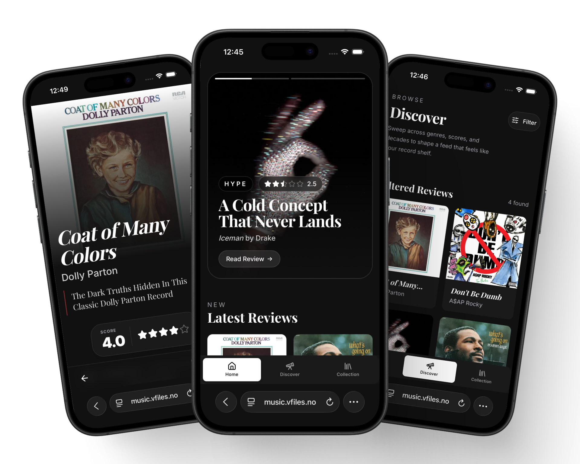
I built music.vfiles.no as a place to publish music reviews, artist pages, and yearly top lists. It’s a Gatsby and React site under the hood, but this post isn’t really about the stack. It’s about a decision I made before writing a single component: design for the phone first, and let the computer screen catch up later.
Why mobile first, actually
Everyone says “mobile first” until it’s inconvenient. Then the moodboard becomes a 1440px Figma frame, the hero image gets a 21:9 crop, and the phone version turns into “well, it’ll probably wrap fine.”
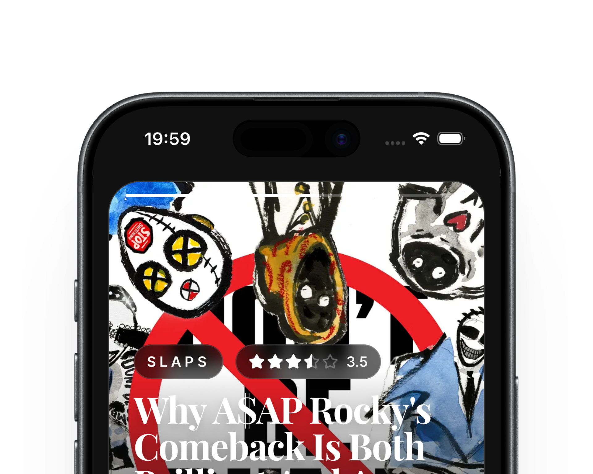
Home feed on mobile. Fair use
I didn’t want that. I read music reviews the same way most people probably do: standing in a kitchen, lying in bed, on a bus, thumb hovering near the bottom third of the screen. Nobody is opening a review site on a 27-inch monitor to casually read what I think of the new A$AP Rocky album. So I designed the whole thing on a phone-sized canvas first, and only afterward asked what the desktop version should look like.
The thumb decides the layout
If you accept that most visitors are holding the site in one hand, a few decisions basically make themselves:
- Navigation goes to the bottom, not the top. A top nav bar is designed for a mouse pointer that can reach anywhere instantly. A thumb can’t reach the top of a 6.7" screen without a grip shift. So Home, Discover, and Collection live in a floating pill anchored to the bottom of the viewport.
- Big touch targets, not dense menus. The nav is three fat buttons, not eight cramped links.
- One column, always. No sidebars, no “related albums” rail next to the thing you’re actually reading.
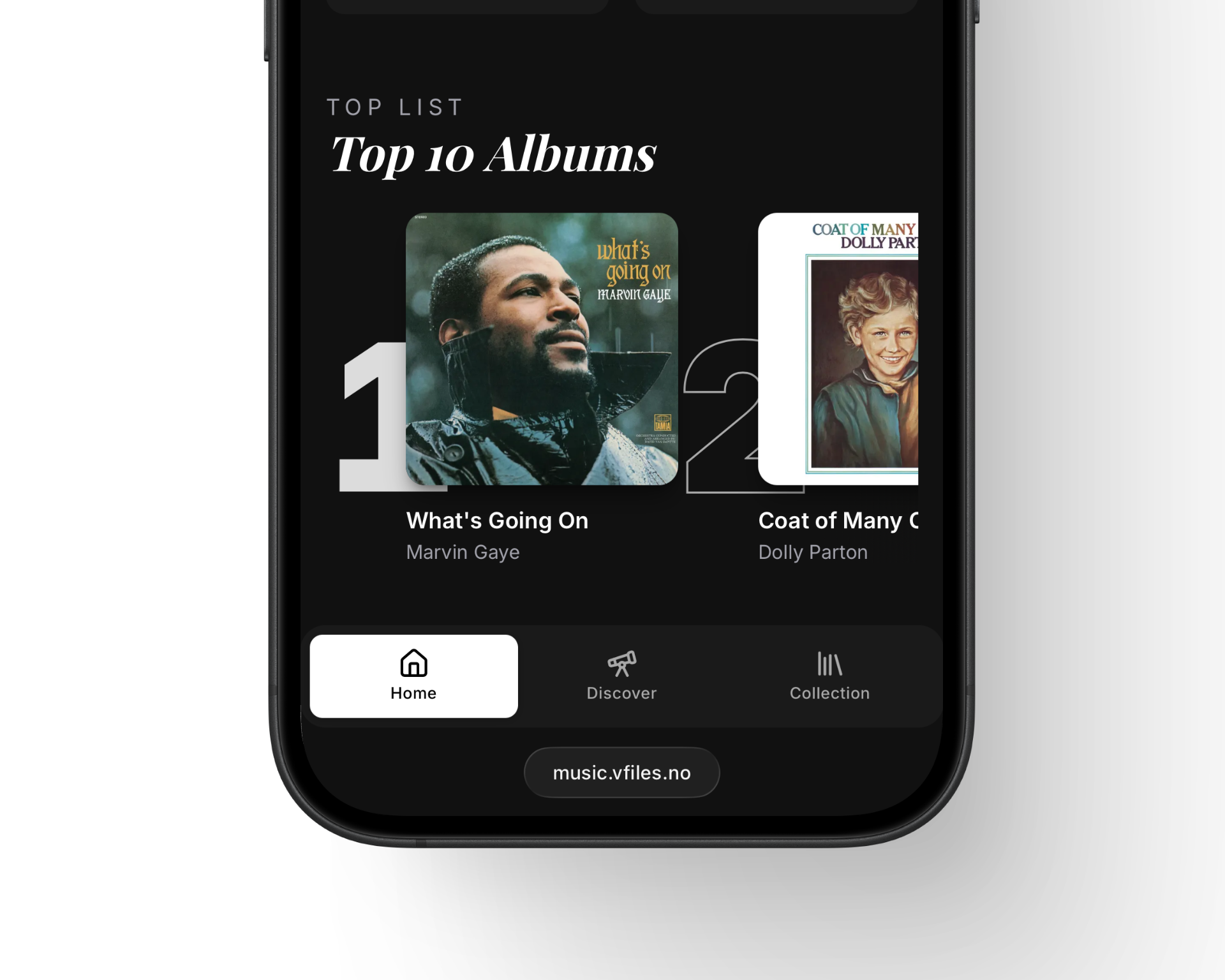
Home feed on mobile. The nav bar floats where the thumb already lives. Fair use
That floating nav turned out to be the one piece of UI that had to be perfect before anything else, because it’s on screen for the entire session. Everything else can scroll away.
Letting the music be the art director
Music reviews live and die on the cover art. So the design gets out of the way as much as possible: full-bleed photography, no card borders around the album sleeve, no drop shadows trying to look “modern.” On an artist page the photo is the background, and the name sits on top of it in a big italic serif, more record sleeve than SaaS dashboard.
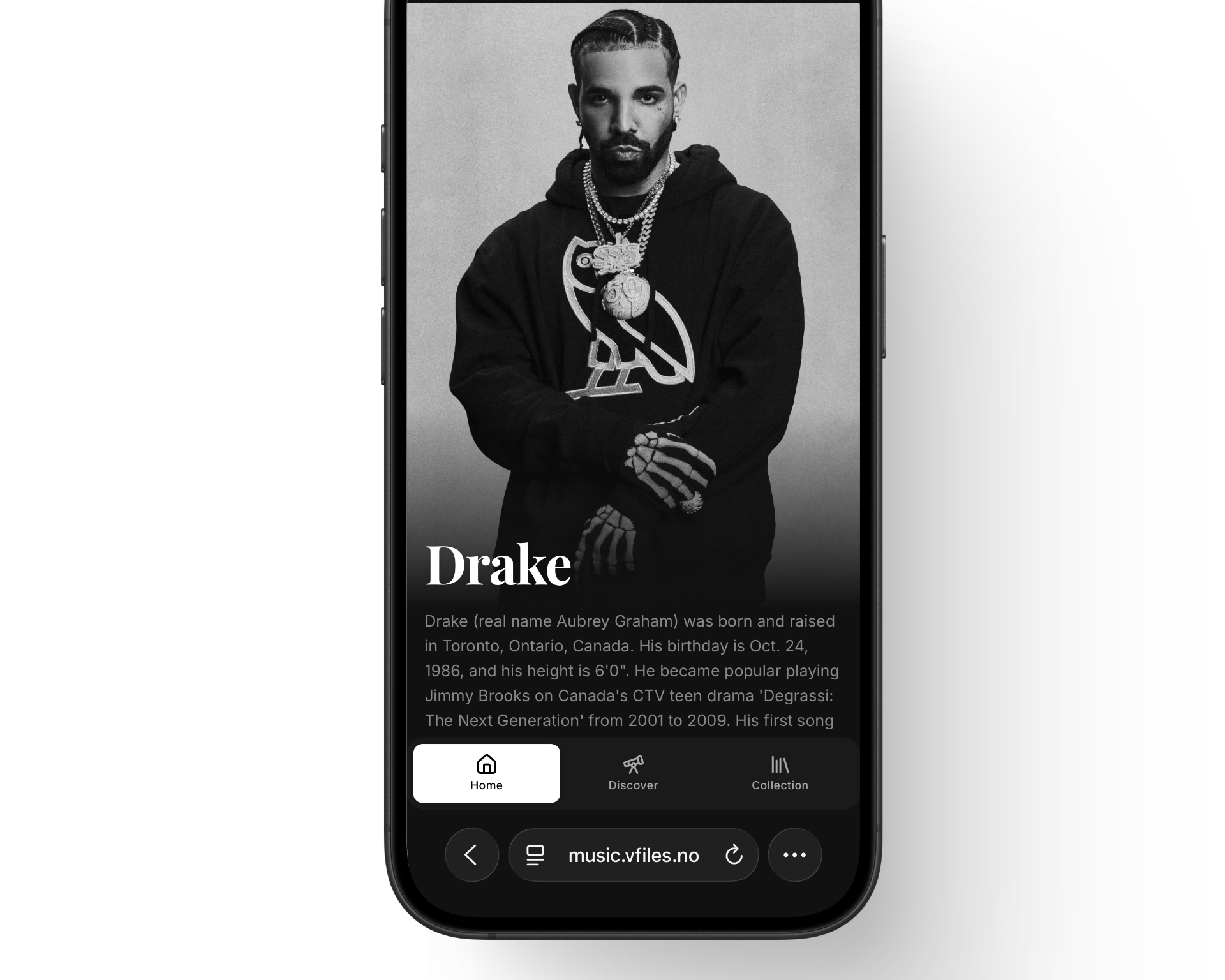
Artist page: the photo is the layout, the serif is the only decoration. Fair use
That serif typeface is doing a lot of the emotional labor for the whole site. Everywhere else (nav labels, byline, tags, buttons) is a plain, boring, highly legible sans-serif. The serif only shows up for titles: album names, artist names, review headlines. It’s the difference between the record sleeve and the liner notes, and I wanted the site to feel like both exist on the same page.
A review needs a verdict, fast
A reader deciding whether to trust a review wants three things immediately: the score, whether the writer actually liked it, and who wrote it. So the review template puts a genre tag, a star rating, and a numeric score right under the fold, before a single word of the actual text.
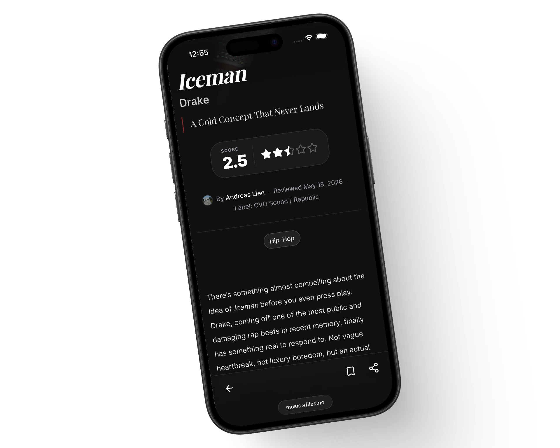
Review detail: verdict first, prose second. Andreas Lien, CC BY-SA 4.0
The italic line under the headline is basically the “deck” you’d get in a print magazine, one sentence that tells you the writer’s actual opinion before you commit to reading four paragraphs to find out. I stole that shamelessly from music journalism, not from any UI pattern library.
Then, and only then, the computer screen
Once the mobile layout felt right, scaling up was mostly a matter of giving the same elements room to breathe rather than redesigning them. The hero gets wider and taller, the single column becomes a grid of review cards, and the “Top 10 Albums” list gets to show off with oversized numerals sitting behind the album art instead of a plain ranked list.
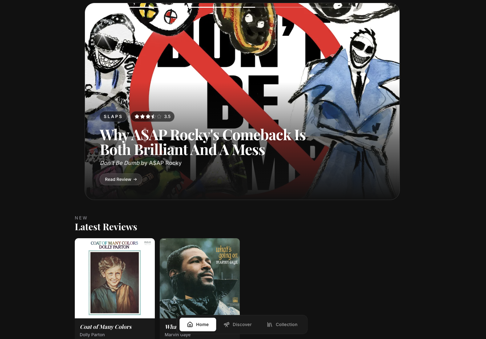
Desktop homepage. Same bones, more room, bigger type. Fair use
The one thing I kept, even though it made zero sense from a “responsive design textbook” point of view, is the floating bottom nav. On a laptop it has no thumb to serve, and it visibly overlaps the album grid instead of sitting politely below it. I’ve gone back and forth on fixing that. But it also functions as a little signature: a reminder that this was built for a hand holding a phone, and the desktop is just a bigger window onto the same idea, not a separate design.
What mobile first actually bought me
Designing bottom-up like this forced a lot of good discipline that I don’t think I would have arrived at starting from a desktop mockup:
- Every screen has one job. There was never room to bolt on a second, competing feature.
- Typography had to carry more of the design, since there wasn’t space for decorative chrome. That’s why the serif/sans-serif split ended up doing so much work.
- The desktop layout came almost for free, because it was never asked to fix anything, only to give the existing decisions more space.
If I’d started on a 1440px canvas, I suspect I’d have ended up with a wide, comfortable desktop site and a mobile version that felt like an apology for it. Starting small and constrained meant the phone version is the real design, and the big screen is just a nice bonus.